Graphic Design
Gurukul Incense - Packaging
A modern incense packaging system rooted in Indian tradition and refined through minimal design.
Year :
2025
Industry :
Fragnance
Client :
Gurukul Incense
Project Duration :
2 weeks

Problem :
In a market crowded with visually noisy incense packaging, Gurukul risked being lost despite its authentic roots. The challenge was to move beyond generic “traditional” visuals and create a system that communicates purity, intention, and cultural depth without feeling dated or ornamental.

Solution :
The design reinterprets tradition through restraint.
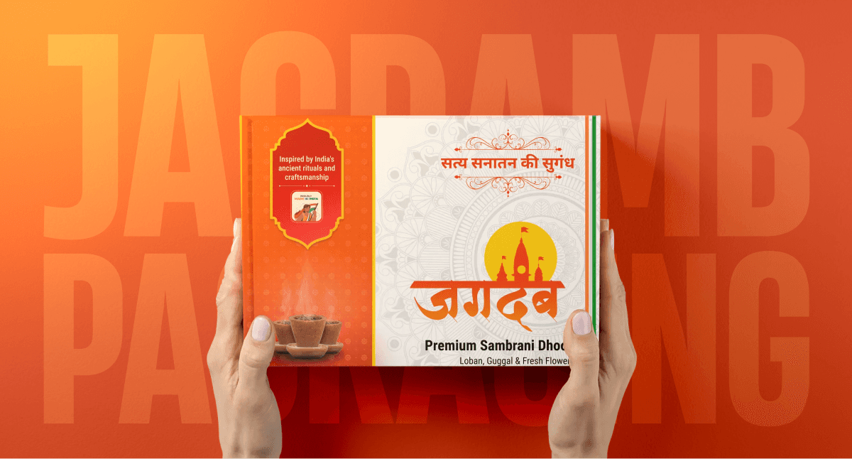
A minimal, structured layout anchors the brand, while color-led differentiation gives each variant its own personality. Earth-inspired tones, ingredient-forward imagery, and calm Hindi typography work together to build trust and clarity. Every element is intentional nothing decorative without meaning.


Challenge :
The real challenge wasn’t adding more it was knowing what to remove.
Balancing regulatory information, cultural symbolism, and shelf presence while maintaining visual calm required disciplined design decisions. Creating variation without visual chaos was key to building a scalable system.
Summary :
This packaging transforms Gurukul into a quietly confident incense brand rooted in Indian tradition, expressed through contemporary design thinking. It’s a system designed not to shout, but to be chosen through clarity, authenticity, and timeless appeal.


More Projects





Graphic Design
Gurukul Incense - Packaging
A modern incense packaging system rooted in Indian tradition and refined through minimal design.
Year :
2025
Industry :
Fragnance
Client :
Gurukul Incense
Project Duration :
2 weeks
Problem :
In a market crowded with visually noisy incense packaging, Gurukul risked being lost despite its authentic roots. The challenge was to move beyond generic “traditional” visuals and create a system that communicates purity, intention, and cultural depth without feeling dated or ornamental.
Solution :
The design reinterprets tradition through restraint.
A minimal, structured layout anchors the brand, while color-led differentiation gives each variant its own personality. Earth-inspired tones, ingredient-forward imagery, and calm Hindi typography work together to build trust and clarity. Every element is intentional nothing decorative without meaning.
Challenge :
The real challenge wasn’t adding more it was knowing what to remove.
Balancing regulatory information, cultural symbolism, and shelf presence while maintaining visual calm required disciplined design decisions. Creating variation without visual chaos was key to building a scalable system.
Summary :
This packaging transforms Gurukul into a quietly confident incense brand rooted in Indian tradition, expressed through contemporary design thinking. It’s a system designed not to shout, but to be chosen through clarity, authenticity, and timeless appeal.
More Projects
Graphic Design
Gurukul Incense - Packaging
A modern incense packaging system rooted in Indian tradition and refined through minimal design.
Year :
2025
Industry :
Fragnance
Client :
Gurukul Incense
Project Duration :
2 weeks
Problem :
In a market crowded with visually noisy incense packaging, Gurukul risked being lost despite its authentic roots. The challenge was to move beyond generic “traditional” visuals and create a system that communicates purity, intention, and cultural depth without feeling dated or ornamental.
Solution :
The design reinterprets tradition through restraint.
A minimal, structured layout anchors the brand, while color-led differentiation gives each variant its own personality. Earth-inspired tones, ingredient-forward imagery, and calm Hindi typography work together to build trust and clarity. Every element is intentional nothing decorative without meaning.
Challenge :
The real challenge wasn’t adding more it was knowing what to remove.
Balancing regulatory information, cultural symbolism, and shelf presence while maintaining visual calm required disciplined design decisions. Creating variation without visual chaos was key to building a scalable system.
Summary :
This packaging transforms Gurukul into a quietly confident incense brand rooted in Indian tradition, expressed through contemporary design thinking. It’s a system designed not to shout, but to be chosen through clarity, authenticity, and timeless appeal.